
Intro
It's hard to make your website accessible to everyone without first understanding all of the different ways people use computers.
The Demo in the Inspire section of the Accessibility sandbox can give you a better sense of how much of a difference making content accessible can be for users who really need it.
At Google, we encourage our web designers and web developers to experience using a screen reader, so they understand what it's like for a blind person to browse the web.
We built this fake site, FriendPurr, to illustrate some of the ways that a website can be inaccessible, to give developers some experience catching and fixing common accessibility issues.
Let’s get started!
Click here to open Friendpurr in a new window
Instructions
Make a note of issues you come across, or places where you feel like the usability could be improved as you take a look at keyboard focus, screen reader navigation, and contrast ratios.
Keyboard Focus
Use the Tab key on your keyboard to try to navigate content on the page. See if content is focusable, and if there is a logical tab order.
It should always be possible to use any web app using only the keyboard. Some users can't easily use a mouse or other pointing device, and others just find it more efficient a lot of the time.
Use Tools to Run an Accessibility Audit
Run the Lighthouse DevTools accessibility audits and take a look at the results. Keep in mind that the audits don’t catch everything, so manually testing is usually needed to ensure an accessible experience.
Try using a screen reader
Turn on the screen reader:
- On a Chromebook, Turn on and off ChromeVox by pressing Ctrl + Alt + Z. Remember that you can press Ctrl to silence speech at any time. If you haven’t used ChromeVox, consider running through the tutorial by pressing Search + O, then T.
- On Mac, if you have a touch bar, you can triple-tap the power button on the touch bar - otherwise press Cmd+F5.
-
NVDA on Windows:
Download the free and open source screen
reader here
Enable: Ctrl + Alt + N
Disable: Insert + Q - Narrator on Windows: Win+Ctrl+Enter
Navigate through the page using the screen reader:
- ChromeVox on Chrome OS: Use Search + Right arrow to go forwards, or Search + Left arrow to go backwards) to navigate through the page and explore its accessibility.
-
Voiceover on Mac: Press Ctrl + Option + Right to move
forward item by item, Ctrl + Option + Left to move
backwards
Press Ctrl + Option + Shift + Down arrow/ Up arrow to interact with (go into/out of) objects (like iframes, menus, application regions, etc.)
Press Enter or Ctrl + Option + Space to activate an item. -
NVDA on Windows:
Check out this tutorial on NVDA for more information
.
Use the arrow keys to move item by item If you land in a text field, press Escape to exit the text field Press Enter to activate - Narrator on Windows: Use arrow keys to move around the page, and press Enter to activate.
Take a look at the content with the screen reader:
- Use Tab to navigate through the top links. What do you notice?
- Navigate to the images on the page. Anything that needs to be updated?
- Can you navigate everywhere you need to? Is your focus position clear?
- Try to share with Marie. What do you notice?
Results
We encourage you to try the steps above for yourself. Once you've done that, compare your notes to some of the issues we found below.
Low Contrast Text
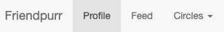
The text on the top nav bar can be hard to see for people with low vision. The ratio here is 4.2 and the guidelines are for text to be above a 4.5:1 ratio. The Chrome DevTools built-in checker can help compute contrast ratios for you.
No Focus Highlights
When navigating by keyboard you can see a focus ring around the different elements. The “Circles” Nav button does not have this highlight. The text becomes bold, but that may be less perceivable to many. We want to ensure clear focus indication to avoid “focus roulette”.
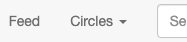
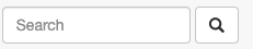
Unlabelled Button
The search button is unlabelled. When using a screen reader the user only hears that it is a “default button” thus not knowing what will happen if the button is selected.
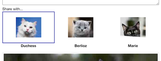
Unlabelled Elements
The different friends that can be shared with are unlabelled
checkboxes. The screen reader just reads checkbox, checked
or unchecked leaving a screen reader user unable to know
what it is they are selecting.
You also can’t use the keyboard to check or uncheck the checkboxes!
And there are unnecessary linear stops on the cat names that
do not verbalize.
Unlabelled Images

The image has no alt-text. A screen reader is only told there is an image without getting any context to what the image is of.
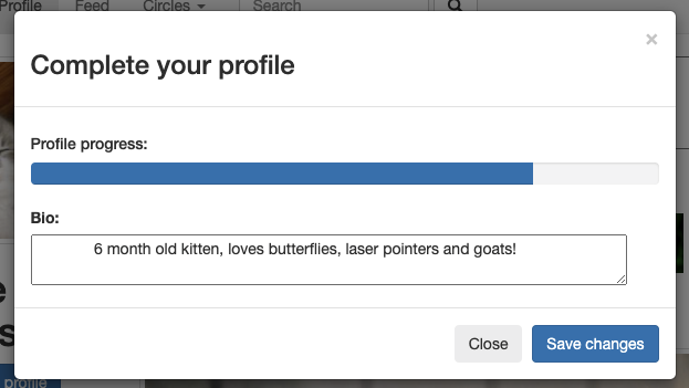
Dialog Issues
When you press the Complete profile button, there are some issues. The window title is verbalized, which is great. But then you hear an uninformative update about progress. You can’t reliably get to the close or save changes button using the screen reader. Also, your focus can navigate outside of the dialog, which shouldn’t be possible with a modal dialog! Your focus should remain inside until you take action with a button or press Esc to close. Also, you can only get to the X close button through pressing Tab, and not through Search + Right or Left. And, the X button has a label of “times, button” instead of “close, button”.